To demonstrate how, to date, they have all been completely useless, with some to the point of being actually harmful, but now that the gauntlet has been cast, he expects the next version of at least one of these maps to only be mostly useless (and maybe even only moderately useless) and mostly harmless. It’s the same reason he developed the initial versions of Solution Map*, because he found all of the big analyst firm maps mostly useless, and completely useless for tech selection.
(On the tech map front, how can you compare the technical capabilities of a solution where the axis are each on subjective classifications such as “strength and “strategy” or “execution” and “vision”, and, furthermore, where each of these nebulous concepts is made up of half a dozen subjective ratings meshed into one. While not perfect, at least Solution Map gave you an apples-to-apples pure objective technology rating (as each question had a defined rating scale based on technical maturity) against an unbiased pure customer opinion. So you at least knew whether or not
- the vendor actually offers a readily available solution of that type
- how it compares to the market average of vendors with actual available solutions of that type)
Thus, if you insisted on using logo maps, he at least wanted to make sure there was at least some redeeming qualities. However, as he has already stated, his map is mostly useless and while a few flaws were corrected on release, some are inherently not addressable. The problem with these maps in general is that, in addition to all the weaknesses the doctor addressed in his release post, namely:
- Some vendors/solutions no longer existed as of release date (which was addressed)
- Many of the categories are meaningless and not actual solution modules (which he corrected, but this means the fit varies across vendors in a category)
- Vendor logos were not clickable, and not even footnoted when all you got was some strange symbol that looks like it should be carved on a 3000 year old ruin (which is the primary improvement, all logos are clickable and take you to the vendor site as of the release date).
4. They are nowhere near complete.
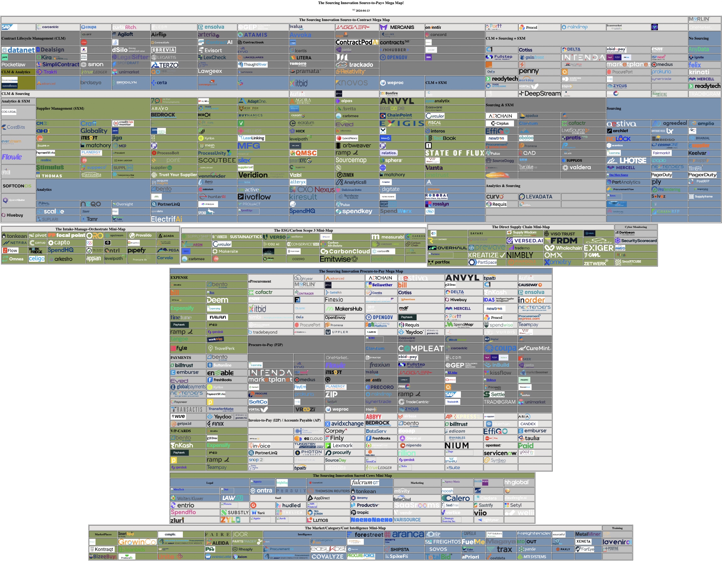
Most of these maps are in the 100 to 150 logo range. As the doctor has clearly demonstrated that’s only 1/7 to 1/10 of the number of vendors in the core space. Furthermore, even though the doctor does a full database update at least annually, he will guarantee that not even his map is close to complete. While he’d wager he has 90% of the vendors actively selling in North America and Western Europe in the core Source-to-Pay buckets, that percentage goes down as you venture out into the periphery. Plus, in some areas, like ESG/Carbon, he tracks only those focussed on carbon/scope 3 accounting with supplier management / sourcing integration capability, and ignores the remaining ESG/Sustainability/Climate vendors, of which there is likely 10 times as many right now (although we’ll see a lot get swallowed up or die off as the space matures). Most of the supply chain risk vendors are missing unless they offer core supplier management capabilities, or integrate with supplier management modules, as well. And so on.
5. The landscape changes daily.
the doctor did a full database review last year when he did his 39 steps … err … 39 clues … err … 39 part Source-to-Pay+ series, and since then, over half a dozen vendors/offerings are completely gone and over a dozen acquired and swallowed into larger vendors. One, acquired in 2022 that was still offered as a standalone solution late March disappeared by the final link checks that began on April 13. So, while these maps are distributed by their creators for months, and sometimes a year, they are only valid as of the last date where the creator actually re-verified every single vendor.
6. The vendors are only comparable at the baseline, IF they are comparable at all.
If no two (2) vendors are created equal, imagine how different twenty (20) are, or one hundred (100)! If you refer back to our previously referenced 39 part Source-to-Pay+ series,
- sourcing vendors break down into RFX, Auction, optimization and may/not contain (best-practice) templates or category expertise
- contract management generally breaks down into negotiation support, (post-signing) lifecycle (execution) management and tracking, and analytics
- spend analysis is similar, but differs on DIY vs. services led, load/classification support vs. self load/(re)class, out of the box report templates, autonomous analysis and opportunity identification, etc.
- supplier management was broken down into the 10-segment CORNED QUIP mash, which expressly excluded DEI, because most application thereof is definitely NOT equitable (as the biggest promoters clearly never looked up what the words actually mean in a dictionary)
- eProcurement, while it revolves around a PO (and, hopefully, a no PO, no pay policy), may or may not have punchout/internal/managed catalog support, may or may not support receiving, may or may not support price tiers and discounts, etc.
- I2P, while it revolves around the invoice, it may or may not support anything beyond internal PO flip or XML, may or may not support m-way match, may or may not integrate with a payment system, etc.
- and the same variation exists across every other category
This is assuming that the creator actually understood what every vendor offered and classified according to what the vendor’s product actually did vs. what language the vendor chose to use to describe their product.
7. Even all the vendors with comparable solutions are NOT relevant for you.
When you are considering a vendor, at the very least you have to consider
- the verticals/industries their solution was designed on, and designed for
- the organizational size they were developed for
and a host of other considerations based on your industry, your organizational size, and the hole you are trying to fill.
This is why so many Source-to-Pay+ selection projects end up not (fully) delivering and why most big consultancies just keep recommending the same-old same-old five (5) (big) vendors regardless of what your needs are, because they don’t know any different and at least those vendors will be around tomorrow. And this leads into a bigger discussion of why these logo maps, like most analyst maps, are NOT appropriate for transformation projects. Which we’ll take up in our next article / rant.
Secure Download the PDF! (or, use HTTP) [HTML]
(5.3M; Note that the Free Adobe Reader might choke on it; Preview on Mac or a Pro PDF application on Windows will work just fine)
* and the doctor would like to make it very clear he had NOTHING to do with the current interface and presentation of Solution Map; it’s likely many of the questions are still his, but to be valuable, SolutionMap has to be properly scored and the ratings properly compared and applied relative to a number of factors not explicitly captured in the map