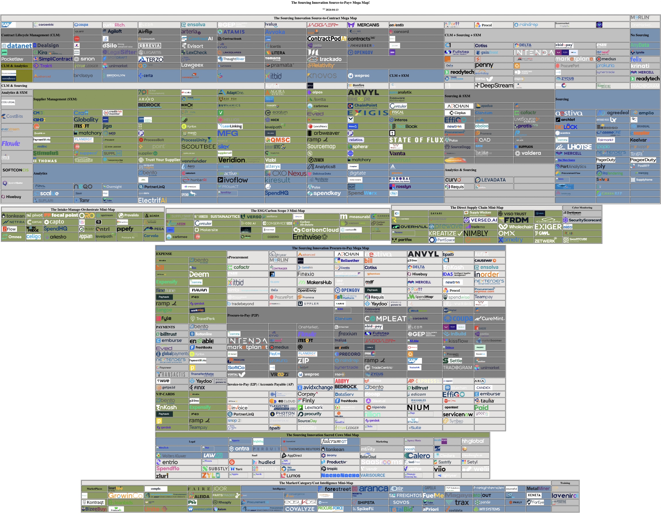
Category Archives: Technology

Digitalization alone is NOT a cure all to our problems!

A recent post on LinkedIn said digitalization is an emergency because:

  • Health workers are feeling squeezed
  • People can’t find the housing they need
  • Farmers can’t find enough hours int he day
  • Manufacturing firms can’t find the workers they need

And while digitalization is an emergency for some businesses, DIGITALIZATION WON’T SOLVE ANY OF THESE PROBLEMS, because lack of is not the core issue. Since the poster is living in Montreal and the doctor is living in Halifax, we’ll focus on the source of the problem from a Canadian perspective, but the reality is that the majority of countries with these issues has the same source problems:

1) Today, 20% of Canadians don’t have a family doctor, compared to 2001 when it was only 13%. This is because, from 2001 to 2021 we saw a 23% population increase. In the same time, we saw a 12% decrease in health workers. (And things have only gotten worse since COVID, but StatsCan is always a couple of years behind. The Nurses association says we are short 60,000 nurses alone!)

2) The national vacancy rate is 1.5%! Year-over-year rent increases are 8%! One bedrooms in downtown Halifax are going for 2K a month! Pre COVID, they were 1K. Pricing is out of control across all major Canadian cities.

3) The days are the same length they’ve always been. What farmers can’t find is enough seasonal workers, despite the unemployment rate, because they can’t afford to pay seasonal workers a living wage. (And that’s why our migrant farm workers in the bigger provinces are essentially facing modern slavery conditions, as per a UN report.)

4) Manufacturers can’t find the workers they need because of a lack of SKILLED workers. Everything is going tech, but yet our STEM graduate rates in Canada hover around 22%! That’s 1 in 5. But if you don’t have decent math, computer, and electronic equipment skills, you don’t have the skills a manufacturer needs.

Thus, it doesn’t matter how much digitization you apply or how good the systems are, we still have the fundamental problems that:

1) it takes a doctor a certain amount of time to properly diagnose a patient, a surgeon a certain amount of time to do a surgery, a nurse time to put in the IV, check the vitals, talk to the patient to do a cognitive assessment, etc. THOSE TIMES CAN NOT BE SHORTENED.

2) We need to BUILD more housing. We need to at least DOUBLE the vacancy rate so that the housing is WHERE it is needed in a market that is COMPETITIVE and REMAINS AFFORDABLE.

3) We need to HALT INFLATION, reduce farm taxes, bring back critical subsidies (and not invent new “grocery taxes” to halt greed mongering, the CEOs will just hike prices for consumers in the end), and make farm work a living wage again.

4) We need to promote and train for STEM.

Only then will digitization help because all it can do is

1) minimize the downtime between seeing patients

2) help people find those affordable units faster and submit applications faster and do the background checks faster

3) help farmers minimize their planning and “back office” operational time

4) help manufacturers get the most from the skilled employees they hire (but there IS a limit on productivity increases)

This is because, as the doctor has said time and time again, all computers are good for is thunking, not thinking, and all Gen-AI does is exacerbate problems because you don’t know if the sh!t it is making up (that’s what generative means — make stuff up) is correct or not! As a result, they can be great at automating tactical data processing and bring the following benefits:

1) centralized country-universal health records, integrated systems, and remote home/self care support — if a nurse or doctor can instantly get all the data on your history they need, they can review it all before seeing you, assess with knowledge, and get to a likely correct diagnosis, and treatment faster; also, if they never have to rekey existing data and just add to the record, it’s less time between patients

2) better three-way support for landlords to find tenants and comply with legislation, tenants to find properties that meet their needs and keep landlords honest (with reviews and instant reports to), regulators who can ensure everyone is using the system properly and fairly

3) easy planning, monitoring, management, and farm-tech selection best suited to the needs of the farm workers based on farm size, location, produce/livestock, and workforce

4) better procurement, production planning, (up)skill(ing) maintenance, design, testing, etc. — maximize every hour on engineering stuff, not back-office paper pushing

But none of this solves the core problems we have or helps if the workers aren’t there to begin with!

Like Analyst Firm 2*2s, Random Logo Maps are NOT Appropriate for Tech Selection!

In our last article, we explained why the doctor created the The Sourcing Innovation Source-to-Pay+ Mega Map, even though he despises logo maps. It was literally the only way he could expose how every one of logo maps released to date was completely useless (and some to the point that they were harmful, but that’s another rant for a later time).

In a nutshell, all of these maps had the following problems, which were correctable (and corrected in the Sourcing Innovation Mega-Map):

  • vendors / solutions no longer existed as of release date
  • categories were meaningless and not actual solution modules
  • vendor logos were not clickable or even footnoted (so you had no clue what that ruin actually represented — a new age vendor or a demonic symbol from a long lost hieroglyphic or symbolic language)

As well as the following problems, which still exist in the Sourcing Innovation Mega-Map (SIMM) because some of them are just not (fully) addressable:

  • nowhere near complete (the further you get away from the Source-to-Pay core, the less complete the SIMM likely is
  • no indication that the landscape changes DAILY (vendors come, get acquired/merge, go out of business, add new capabilities and modules, drop existing modules, etc.)
  • the vendors aren’t always comparable even at a functionality baseline
  • not all vendors with a comparable solution are relevant to the same (type of) company

We ended our last article noting that the right vendor for you was dependent not just on the module(s) you needed to address the process gaps the transformation consultants defined, but the industry/vertical you are in, the size of your organization, the cross-organization user base you need to support, and their technical intelligence (TQ).

The logo maps don’t capture that. (But, to be fair, the vast majority of the analyst market maps don’t either.)

But more importantly, they don’t always (accurately) capture what solution(s) a vendor accurately captures. The reason for this is that, to be completely accurate, the creator would have to be fully aware of, and have seen, the current full end-to-end solution as of the day the map was released and then accurately map the providers’ solutions to each of their logo map categories.

the doctor has likely reviewed more Source-to-Pay solutions over the past 19 years as an analyst than almost any other analyst except for Mickey North Rizza (15 years at AMR / Gartner / IDC), Duncan Jones (who was Forrester Vice President and Principal S2P analyst for 16 years straight), and Pierre Mitchell (25 years at AMR / Hackett / Spend Matters). (Just about every other technology analyst still active in our space has only been a full time market analyst for a decade or less.) Even though he has reviewed, in depth, over 500 hundred solutions (and written about 350+ in detail on Sourcing Innovation and Spend Matters [but good luck finding at least 1/3 of the Spend Matters coverage since, as previously mentioned, the site refresh dropped co-authors on many articles, many of his articles were co-authored, and he was always second billing], he hasn’t even seen half the solutions on the map in depth (but still believes the ratio of in-depth vendor knowledge that went into this map is still greater than every other logo map produced). As a result, his classifications, like any other analyst, are based on, in order:

  • in depth demos, diligence or evaluation projects
  • detailed vendor communications (beyond just what’s on the website)
  • website / third party summaries (looking at the functionality where possible, not just the language)

Which means that, if the website/materials were out of date when reviewed (and it’s been a few years since the last review), the classification could now be highly inaccurate. The eProcurement vendor could have shifted mostly to I2P/AP. The supplier management vendor found a niche in risk management or category sourcing and dropped most SXM capabilities. The contract management solution, interchangeable with forty others, didn’t get traction and was dropped. And so on.

So if your mileage varies in this map, put together by someone who has consistently been at least a part time (if not full time) analyst since Sourcing Innovation was started in 2006, imagine how much it will vary in a map put together by a former consultant, who might have only seen the same ten solutions he was always implementing in depth, or a former product manager who doesn’t have a solid technical background and can’t accurately judge the true capabilities and potential of the solution he’s looking at. (the doctor has an earned PhD in computer science and has been a software architect / research scientist / CTO, compared to the average analyst who, in the early days, came from an operations / logistics / management background if you were lucky and a journalism,
English, or history background [because they could actually write] if you weren’t.)

In other words, no matter how cool these (logo) maps look, at best they will be mostly useless (if they give you clickable logos so you can begin your own research effort), or completely useless otherwise.

Secure Download the PDF!  (or, use HTTP) [HTML]
(5.3M; Note that the Free Adobe Reader might choke on it; Preview on Mac or a Pro PDF application on Windows will work just fine)

the doctor dislikes logo maps! So why did he create one?

To demonstrate how, to date, they have all been completely useless, with some to the point of being actually harmful, but now that the gauntlet has been cast, he expects the next version of at least one of these maps to only be mostly useless (and maybe even only moderately useless) and mostly harmless. It’s the same reason he developed the initial versions of Solution Map*, because he found all of the big analyst firm maps mostly useless, and completely useless for tech selection.

(On the tech map front, how can you compare the technical capabilities of a solution where the axis are each on subjective classifications such as “strength and “strategy” or “execution” and “vision”, and, furthermore, where each of these nebulous concepts is made up of half a dozen subjective ratings meshed into one. While not perfect, at least Solution Map gave you an apples-to-apples pure objective technology rating (as each question had a defined rating scale based on technical maturity) against an unbiased pure customer opinion. So you at least knew whether or not

  1. the vendor actually offers a readily available solution of that type
  2. how it compares to the market average of vendors with actual available solutions of that type)

Thus, if you insisted on using logo maps, he at least wanted to make sure there was at least some redeeming qualities.  However, as he has already stated, his map is mostly useless and while a few flaws were corrected on release, some are inherently not addressable.  The problem with these maps in general is that, in addition to all the weaknesses the doctor addressed in his release post, namely:

  • Some vendors/solutions no longer existed as of release date (which was addressed)
  • Many of the categories are meaningless and not actual solution modules (which he corrected, but this means the fit varies across vendors in a category)
  • Vendor logos were not clickable, and not even footnoted when all you got was some strange symbol that looks like it should be carved on a 3000 year old ruin (which is the primary improvement, all logos are clickable and take you to the vendor site as of the release date).

4. They are nowhere near complete.
Most of these maps are in the 100 to 150 logo range. As the doctor has clearly demonstrated that’s only 1/7 to 1/10 of the number of vendors in the core space. Furthermore, even though the doctor does a full database update at least annually, he will guarantee that not even his map is close to complete. While he’d wager he has 90% of the vendors actively selling in North America and Western Europe in the core Source-to-Pay buckets, that percentage goes down as you venture out into the periphery. Plus, in some areas, like ESG/Carbon, he tracks only those focussed on carbon/scope 3 accounting with supplier management / sourcing integration capability, and ignores the remaining ESG/Sustainability/Climate vendors, of which there is likely 10 times as many right now (although we’ll see a lot get swallowed up or die off as the space matures). Most of the supply chain risk vendors are missing unless they offer core supplier management capabilities, or integrate with supplier management modules, as well. And so on.

5. The landscape changes daily.
the doctor did a full database review last year when he did his 39 steps … err … 39 clues … err … 39 part Source-to-Pay+ series, and since then, over half a dozen vendors/offerings are completely gone and over a dozen acquired and swallowed into larger vendors. One, acquired in 2022 that was still offered as a standalone solution late March disappeared by the final link checks that began on April 13. So, while these maps are distributed by their creators for months, and sometimes a year, they are only valid as of the last date where the creator actually re-verified every single vendor.

6. The vendors are only comparable at the baseline, IF they are comparable at all.
If no two (2) vendors are created equal, imagine how different twenty (20) are, or one hundred (100)! If you refer back to our previously referenced 39 part Source-to-Pay+ series,

  • sourcing vendors break down into RFX, Auction, optimization and may/not contain (best-practice) templates or category expertise
  • contract management generally breaks down into negotiation support, (post-signing) lifecycle (execution) management and tracking, and analytics
  • spend analysis is similar, but differs on DIY vs. services led, load/classification support vs. self load/(re)class, out of the box report templates, autonomous analysis and opportunity identification, etc.
  • supplier management was broken down into the 10-segment CORNED QUIP mash, which expressly excluded DEI, because most application thereof is definitely NOT equitable (as the biggest promoters clearly never looked up what the words actually mean in a dictionary)
  • eProcurement, while it revolves around a PO (and, hopefully, a no PO, no pay policy), may or may not have punchout/internal/managed catalog support, may or may not support receiving, may or may not support price tiers and discounts, etc.
  • I2P, while it revolves around the invoice, it may or may not support anything beyond internal PO flip or XML, may or may not support m-way match, may or may not integrate with a payment system, etc.
  • and the same variation exists across every other category

This is assuming that the creator actually understood what every vendor offered and classified according to what the vendor’s product actually did vs. what language the vendor chose to use to describe their product.

7. Even all the vendors with comparable solutions are NOT relevant for you.

When you are considering a vendor, at the very least you have to consider

  • the verticals/industries their solution was designed on, and designed for
  • the organizational size they were developed for

and a host of other considerations based on your industry, your organizational size, and the hole you are trying to fill.

This is why so many Source-to-Pay+ selection projects end up not (fully) delivering and why most big consultancies just keep recommending the same-old same-old five (5) (big) vendors regardless of what your needs are, because they don’t know any different and at least those vendors will be around tomorrow. And this leads into a bigger discussion of why these logo maps, like most analyst maps, are NOT appropriate for transformation projects. Which we’ll take up in our next article / rant.

Secure Download the PDF!  (or, use HTTP) [HTML]
(5.3M; Note that the Free Adobe Reader might choke on it; Preview on Mac or a Pro PDF application on Windows will work just fine)

* and the doctor would like to make it very clear he had NOTHING to do with the current interface and presentation of Solution Map; it’s likely many of the questions are still his, but to be valuable, SolutionMap has to be properly scored and the ratings properly compared and applied relative to a number of factors not explicitly captured in the map

The Sourcing Innovation Source-to-Pay+ Mega Map!

Now slightly less useless than every other logo map that clogs your feeds!

1. Every vendor verified to still be operating as of 4 days ago!
Compare that to the maps that often have vendors / solutions that haven’t been in business / operating as a standalone entity in months on the day of release! (Or “best-of” lists that sometimes have vendors that haven’t existed in 4 years! the doctor has seen both — this year!)

2. Every vendor logo is clickable!
the doctor doesn’t know about you, but he finds it incredibly useless when all you get is a strange symbol with no explanation or a font so small that you would need an electron microscope to read it. So, to fix that, every logo is clickable so you can go to the site and at least figure out who the vendor is.

3. Every vendor is mapped to the closest standard category/categories!
Furthermore, every category has the standard definitions used by Sourcing Innovation and Spend Matters!
the doctor can’t make sense of random categories like “specialists” or “collaborative” or “innovative“, despises when maps follow this new age analyst/consultancy award trend and give you labels you just can’t use, and gets red in the face when two very distinct categories (like e-Sourcing and Marketplaces or Expenses and AP are merged into one). Now, the doctor will also readily admit that this means that not all vendors in a category are necessarily comparable on an apples-to-apples basis, but that was never the case anyway as most solutions in a category break down into subcategories and, for example, in Supplier Management (SXM) alone, you have a CORNED QUIP mash of solutions that could be focused on just a small subset of the (at least) ten different (primary) capabilities. (See the link on the sidebar that takes you to a post that indexes 90+ Supplier Management vendors across 10 key capabilities.)

Secure Download the PDF!  (or, use HTTP) [HTML]
(5.3M; Note that the Free Adobe Reader might choke on it; Preview on Mac or a Pro PDF application on Windows will work just fine)

4 Smart Technologies Modernizing Sourcing Strategy — Not Just Doctor Approved!

IBM recently published a great article on 4 smart technologies modernizing sourcing strategies that was great for two reasons. One, they are all technologies that will greatly improve your sourcing. We’ll explain why.

Automation

Business Process Automation (BPA, or RPA — Robotic Process Automation) can optimize sourcing workflows as well as procurement workflows. With good categorization, demand forecasting, inventory management, price intelligence, templates, strategies, situational analysis (that qualitatively and quantitatively define when a strategy should be applied), and workflow, you can automate sourcing just as much as you can automate Procurement. You can eliminate all of the tactical and focus solely on the strategic analysis and decision making.

Blockchain

If you need to record information in a manner that can be publicly accessed and verified, such as to ensure that records for traceability can be independently verified, or to publicly record ownership, blockchain is a great technology as its ultra secure. In Sourcing and Procurement, it can be used to track orders, payments, accounts, and more across global supply chains and multiple private and public parties.

Analytics

In addition to providing an organization with deep insights into their spend and (process level) performance, analytics engines and their “big data brains” provide real-time sourcing flexibility and visibility to enhance order management, inventory management, and logistics management. With proper intelligence, sourcing teams can understand and act on changes in the increasingly complex supply chain — as they happen.

AI

When deep data and analytics are paired with AI, the deep insights can improve forecasts, help identify risk, and provide suggestions for management.

And this brings us to the next great aspect of the article. Not once did it mention Gen-AI. Not once. As the doctor has been stating over and over, the classic analytics, optimization and machine learning you have been ignoring for almost two decades will do wonders for your supply chain. (Blockchain is not always necessary, but will help in the right situation.)