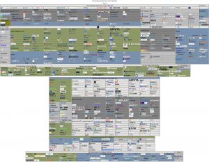
Now slightly less useless than every other logo map that clogs your feeds!
1. Every vendor verified to still be operating as of 4 days ago!
Compare that to the maps that often have vendors / solutions that haven’t been in business / operating as a standalone entity in months on the day of release! (Or “best-of” lists that sometimes have vendors that haven’t existed in 4 years! the doctor has seen both — this year!)
2. Every vendor logo is clickable!
the doctor doesn’t know about you, but he finds it incredibly useless when all you get is a strange symbol with no explanation or a font so small that you would need an electron microscope to read it. So, to fix that, every logo is clickable so you can go to the site and at least figure out who the vendor is.
3. Every vendor is mapped to the closest standard category/categories!
Furthermore, every category has the standard definitions used by Sourcing Innovation and Spend Matters!
the doctor can’t make sense of random categories like “specialists” or “collaborative” or “innovative“, despises when maps follow this new age analyst/consultancy award trend and give you labels you just can’t use, and gets red in the face when two very distinct categories (like e-Sourcing and Marketplaces or Expenses and AP are merged into one). Now, the doctor will also readily admit that this means that not all vendors in a category are necessarily comparable on an apples-to-apples basis, but that was never the case anyway as most solutions in a category break down into subcategories and, for example, in Supplier Management (SXM) alone, you have a CORNED QUIP mash of solutions that could be focused on just a small subset of the (at least) ten different (primary) capabilities. (See the link on the sidebar that takes you to a post that indexes 90+ Supplier Management vendors across 10 key capabilities.)
Secure Download the PDF! (or, use HTTP) [HTML]
(5.3M; Note that the Free Adobe Reader might choke on it; Preview on Mac or a Pro PDF application on Windows will work just fine)

